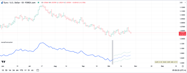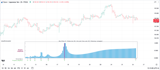
Once the mesaForecaster indicator has been activated for your account (for either a trial or after purchase) it will appear in the Invite-Only scripts section of your TradingView indicators dialog. You may need to log out and log back in to see it. When you first load the indicator into a chart it will look something like this:
By default, the Plot Forecast option will be active (under Select Plot), the bar offset will be 15 bars back and the plot extension will also be 15 bars. This is a good setup to use for inspecting the accuracy of the AR forecast by comparing the forecasted values to the actual values in the price pane.
In addition to Plot Forecast, you can select from Plot Cycles, Plot Primary Cycle Only, Plot Composite, or Plot Spectrum from the Select Plot dropdown. Each of these is discussed in more detail below.
Plot Forecast
This is the default plot in the indicator and, as mentioned in the introduction, the forecast is created by fitting an autoregressive model to the selected input time series and generating a forecast for X number of bars into the future based on the trends and patterns identified in the source data. A set of bands is also generated which represent the upper and lower bounds of the 95% prediction interval.
The plot itself is based on whatever input source you have selected. By default the input source will be the hl2 values of the chart. But you can select any input source you like, including the output of other indicators. For example, you can load a moving average in the chart and then use the moving average as the input into mesaForecaster (which is actually recommended). Or you can load something like the RSI or CCI and use that as your input source...it is entirely up to you. Technically, any plot or indicator that is available in the chart can be used as the input source for the mesaForecaster indicator.
In terms of forecasting price data, it is recommended that you use some kind of filtered input (i.e., like a moving average) rather than the raw price data, as this will improve the accuracy of the forecast since it reduces noise.
The silver vertical bar you see in the snapshot above is the current offset. So the MEM algorithm only sees the input source data to the left of that offset (and including the offset) which is called the in-sample period, and it knows nothing about the input source data to the right of the offset, which is called the out-of-sample period. The plot on the left-hand side of the offset is a solid line while the plot to the right of the offset is a dotted line (and includes the prediction interval bands).
You can adjust the offset from 0 to whatever value you like. When testing/validating the forecast it is useful to use an offset of 10 to 15 bars so that you can use the out-of-sample period to compare the forecasted values to what actually happened. When using mesaForecaster on live data (i.e., after you have found the input source and/or settings that create the most accurate forecast) you will probably want to use an offset of 0 or 1. The reason for this is that the accuracy of the forecast drops off rapidly after the first few bars, which is not unexpected.
In terms of accuracy, we conducted several ad-hoc tests to try and develop a baseline. We used a WMA 20-period average as the input source and, for the first 3 bars of the forecast we measured the directional accuracy versus what actually happened with the moving average on those 3 bars.
So if the 1st bar forecast indicated that the moving average would move up, and the moving average actually did move up relative to the prior bar then that would be an accurate forecast. If the forecast moved up but the actual average moved down that would be an inaccurate forecast. As mentioned, we performed this test on the first 3 forecasted bars, and we ran the test over 1000 bars. By that I mean we generated a forecast, inspected the first 3 bars of the forecast relative to what actually happened, moved forward by one bar and generated a new forecast...and on and on for 1000 bars.
We tested all four of the Window Size options over several different securities and came up with the following averaged results:
Window Size |
Bar 1 Forecast |
Bar 2 Forecast |
Bar 3 Forecast |
Total Bars |
Avg Accuracy |
1024 |
85.20% |
79.20% |
76.50% |
1000 |
80.30% |
512 |
86.30% |
80.00% |
74.50% |
1000 |
80.26% |
256 |
85.70% |
78.90% |
71.70% |
1000 |
78.70% |
128 |
81.80% |
75.90% |
67.80% |
1000 |
75.16% |
As you can see the results are not bad at all. The 512 Window Size bar #1 forecast was accurate in terms of direction 86.30% of the time on average in our tests, but all Window Sizes performed reasonably well and they were all fairly close in terms of average accuracy. If the same test were to be performed on raw price data I would expect the average accuracy values to be lower simply because of the additional high-frequency noise that would be introduced.
Technically, you can produce a forecast of up to 100 bars into the future but, as mentioned above, the accuracy of the forecast will typically begin dropping off sharply once you pass first few bars due to the fact that we are dealing with non-stationary time series. But keep in mind that even a very short-term forecast of 1 to 3 bars can be very useful if conducted, for example, on a higher-timeframe while you are trading on a lower-timeframe.
If you generate a forecast when using an offset and a plot extension (as in our snapshot above where our bar offset is 15 and our plot extension is also 15) the system will recognize this and will compare the forecast to the actual out-of-sample data to quantify the accuracy and will plot 3 metrics in a dialog on the chart. You can find more information in the Forecast Accuracy Metrics topic.
The following settings can be adjusted/tweaked when using the Plot Forecast option:
•Bar Offset - recommend that you use a Manual Bar Offset
•Price Source
•DeTrend/Standardize Data
•Forecast/Cycle Plot Extension
Plot Cycles
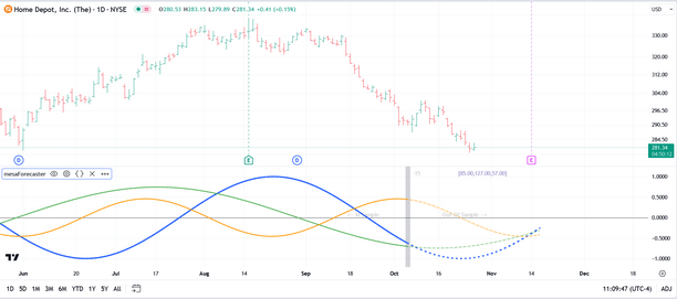
In the example below you can see that the top 3 cycles extracted from the price data have been plotted in relative amplitude and in the correct phase. The cycle periods are listed just to the right of the bar offset and in this case the top 3 cycles are 85.00, 127.00, and 57.00. The Plot Cycles option gives you a very graphical view of the cyclical content of the input data source you have selected and allows you to see the dominant cycles in action. Specifically it allows you to clearly see where cycle tops and bottoms are likely to occur.
The silver vertical line in the chart snapshot above represents the automatically calculated offset for the cycle analysis itself. Using an offset is important since it provides us with an out-of-sample period in the price action that we can use to confirm that the cycles are still in play. If the cycle analysis does NOT track well in the out-of-sample period then we can either select a different offset, different Window Size, or select a different bar interval for the analysis.
So, in the example above, the price data to the left of the silver bar-offset line was used for the cycle analysis (in this case, 512 bars of price data were used) and we refer to that as the in-sample period. The price data to the right of the silver bar-offset line was NOT used for the cycle analysis and we refer to that as the out-of-sample period. We use this out-of-sample period to validate (or discard) the cycle analysis by observing how well the plotted cycles match with the out-of-sample price action that actually occurred.
If the Auto-Calc Bar Offset option is selected, the indicator will automatically calculate an offset to use based on pivots in the price data. If the Auto-Calc Bar Offset option is turned off then you must input your own Manual bar offset. The best offset to use for this kind of cycle analysis will be one or two bars past a recent major or intermediate swing in the price action. It is highly recommended that you do NOT use an offset of 0 since this will preclude any validation of the cycles via a out-of-sample period.
|
Note: The term "in-sample" refers to the data segment actually used to perform the cycle analysis and we would expect the cycles to align nicely with the in-sample data segment. The term "out-of-sample" refers to the price action immediately following the data segment used for the cycle analysis. This price data was not seen by the cycle analysis process and it serves to confirm that the cycles extracted from the data segment are still active and in play. Using this methodology we do not have to trust that the cycles are active and correct, we can see it with our own eyes by comparing the cycle projection to what actually happened in the out-of-sample period. |
In terms of application you will typically want to find a Bar Offset, Window Size, and Price Source that give you a strong match in the out-of-sample period. To fine tune the plot you can also experiment with the Windowing Function and adjusting the Poles. Once you have a strong match in the out-of-sample period in terms of the price action matching the projected cycles, you can typically leave the current Bar Offset in place as new bars come in and use the cycle plot to make educated guesses as to where turning points are likely to occur.
As with the Plot Forecast option, the cycle plot itself will be based on whatever input source you have selected. By default the input source will be the hl2 values of the chart. But you can select any input source you like, including the output of other indicators.
The following settings can be adjusted/tweaked when using the Plot Cycles option:
•Bar Offset - recommend that you use the Auto-Calc Bar Offset
•Price Source
•Amplitude Filter
•Upper Cycle Limit
•Lower Cycle Limit
•DeTrend/Standardize Data
•Forecast/Cycle Plot Extension
Plot Primary Cycle Only
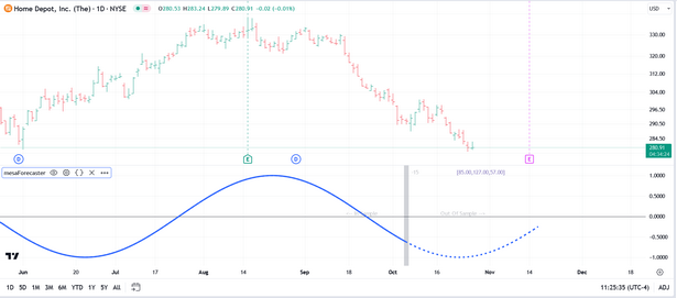
This option is identical to the Plot Cycles option above but it will only plot the dominant/primary cycle as per the example below:
The following settings can be adjusted/tweaked when using the Plot Primary Cycle Only option:
•Bar Offset - recommend that you use the Auto-Calc Bar Offset
•Price Source
•Amplitude Filter
•Upper Cycle Limit
•Lower Cycle Limit
•DeTrend/Standardize Data
•Forecast/Cycle Plot Extension
Plot Composite
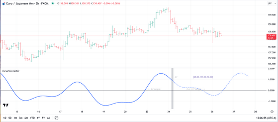
The Composite plot is simply a summation of the individual cycles (and their phase and amplitude) that were extracted during the MEM analysis process. It sums the amplitude and phase for each cycle along each point and creates a single plot that serves as a proxy for the price action. This represents how the price action would unfold if all of the noise in the price data was stripped away (and, of course, assuming no external events trigger a sudden change in the behavior of the security).
In the chart snapshot above, the three individual cycles have been replaced by the composite. As with the individual cycle plot, the segment to the left of the silver bar-offset line is the in-sample period while all data to the right of the silver bar-offset line represents the out-of-sample period. And as with the individual cycle plot you should use the out-of-sample segment to validate and verify that the cycles are still present (i.e., the price action closely matches the composite projection).
Whether you use Plot Cycles or Plot Composite is strictly a matter of choice. Both display the same core information, but just in slightly different formats.
The following settings can be adjusted/tweaked when using the Plot Composite option:
•Bar Offset - recommend that you use the Auto-Calc Bar Offset
•Price Source
•Amplitude Filter
•Upper Cycle Limit
•Lower Cycle Limit
•DeTrend/Standardize Data
•Forecast/Cycle Plot Extension
Plot Spectrum
A MEM power spectrum is a representation of how the power or variance of a time series is distributed across different frequencies. In simpler terms, it shows which cycles or periodic patterns are dominant in the data and how strong they are. The MEM power spectrum is generated using a sophisticated technique that extends an existing time series into the future, and then analyzes the extended series to determine the distribution of power across various frequencies.
In financial time series analysis, a MEM power spectrum can be incredibly valuable. Financial markets are influenced by a myriad of factors, resulting in data that contains trends, cycles, and noise. The MEM power spectrum can help to untangle these components, highlighting the dominant cycles that may be driving market movements. For instance, if a particular frequency has a high power in the spectrum, it indicates a strong cyclical pattern at that frequency, which could correspond to a regular market phenomenon like seasonal trading patterns, business cycles, or other economic indicators. Traders, investors, and analysts can use this information to better understand the underlying market dynamics, and make more informed trading decisions. By identifying the significant cycles and understanding their nature, investors and analysts can also devise strategies to mitigate risks and capitalize on potential market opportunities.
In the chart snapshot above, the blue histogram represents the power spectrum based on the window size selected (in this case that is 256 bars). The peaks in the histogram represent the distinct cycles that were observed in the data. In this case the strongest cycle (it is a peak that has the highest amplitude) is the 48-period cycle and you can see that it is plotted in a different color indicating that it is indeed the dominant cycle. The remaining cycles found were 22, 30, 15, 10, and 7 respectively.
The legend at the top of the spectrum will always show you the current bar offset, your current window size (sample size), the minimum and maximum cycle periods that appear in the spectrum, and the windowing function being used. Adjusting the Upper Cycle Limit and Lower Cycle Limit options in the menu will impact the min/max values in the spectrum.
In addition to providing a visual representation of the cyclical content of the price data, the power spectrum can also be used to visualize the impact of selecting different windowing functions.
The following settings can be adjusted/tweaked when using the Plot Spectrum option:
•Bar Offset - recommend that you use a Manual Bar Offset
•Price Source
•Upper Cycle Limit
•Lower Cycle Limit
•DeTrend/Standardize Data
See Also:
