
Indicator Basics
When the cycleAnalyzer indicator is first loaded, it should look something like the snapshot below (click to enlarge):
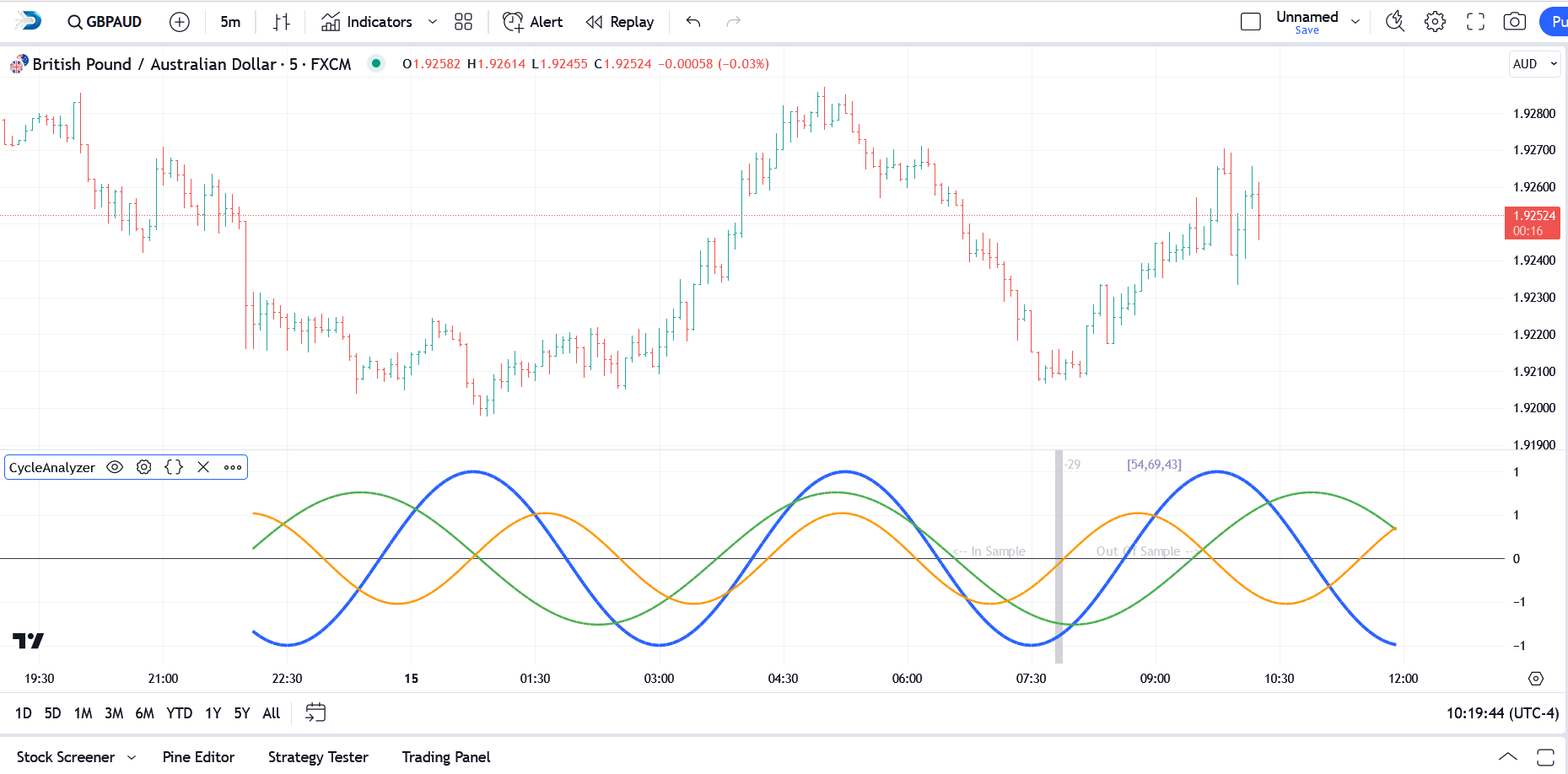
In the example above you can see that the top 3 cycles extracted from the price data have been plotted in relative amplitude and in the correct phase. The cycle periods are listed just to the right of the bar offset and in this case the top 3 cycles are 54, 69, and 43. Note that the cycle analysis is actually performed in 1/4-cycle increments to increase the accuracy. So, for example, it is possible to see a cycle listed as 51.25, or 30.75, etc.
The silver vertical line in the chart snapshot above represents the automatically calculated offset for the cycle analysis itself. Using an offset is important since it provides us with an out-of-sample period in the price action that we can use to confirm that the cycles are still in play. If the cycle analysis does NOT track well in the out-of-sample period then we can either select a different offset or select a different bar interval for the analysis.
So, in the example above, the price data to the left of the silver bar-offset line was used for the cycle analysis (in this case, 256 bars of price data were used) and we refer to that as the "In Sample" data segment. The price data to the right of the silver bar-offset line was NOT used for the cycle analysis and we refer to that as the "Out of Sample" data segment. We use this "Out of Sample" data segment to validate (or discard) the cycle analysis by observing how well the plotted cycles match with the "Out of Sample" price action that actually occurred.
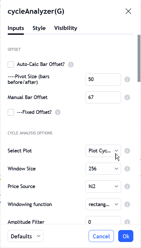
If the Auto-Calc Bar Offset option is selected, the indicator will automatically calculate an offset to use based on pivots in the price data. If the Auto-Calc Bar Offset option is turned off then you must input your own bar offset. The best offset to use will be one or two bars past a recent major or intermediate swing in the price action. It is highly recommended that you do NOT use an offset of 0 since this will preclude any validation of the cycles via a out-of-sample period.
|
Note: The term "in-sample" refers to the data segment actually used to perform the cycle analysis and we would expect the cycles to align nicely with the in-sample data segment. The term "out-of-sample" refers to the price action immediately following the data segment used for the cycle analysis. This price data was not seen by the cycle analysis process and it serves to confirm that the cycles extracted from the data segment are still active and in play. Using this methodology we do not have to trust that the cycles are active and correct, we can see it with our own eyes by comparing the cycle projection to what actually happened in the out-of-sample period. |

Plotting the Composite
The Composite plot is simply a summation of the individual cycles (and their phase and amplitude) that were extracted during the cycle analysis process. It sums the amplitude and phase for each cycle along each point and creates a single plot that serves as a proxy for the price action. This represents how the price action would unfold if all of the noise in the price data was stripped away (and, of course, assuming no external events trigger a sudden change in the behavior of the security).
To activate the composite plot, simply select Plot Composite from the Select Plot option in the settings dialog (click to enlarge):
Click the Ok button to close the settings dialog and the composite plot will be created and displayed in the indicator pane (click to enlarge):
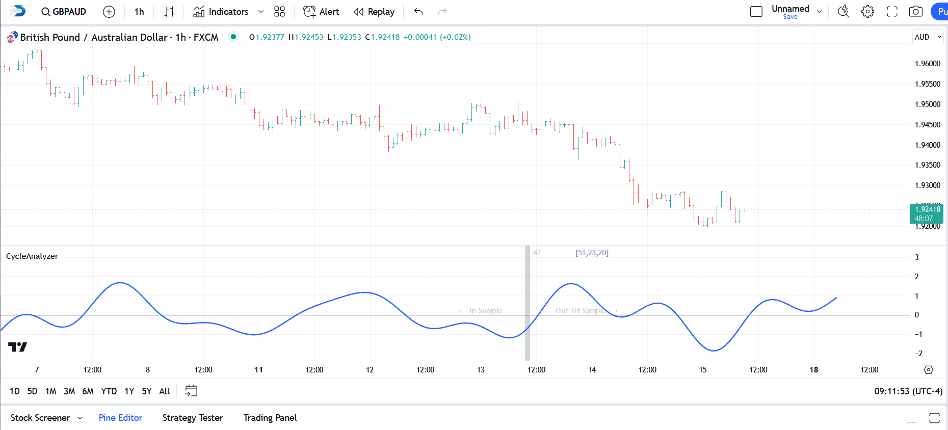
In the chart snapshot above, the three individual cycles have been replaced by the composite. As with the individual cycle plot, the segment to the left of the silver bar-offset line is the "In Sample" data segment while all data to the right of the silver bar-offset line represents the "Out of Sample" segment. And as with the individual cycle plot you should use the "Out of Sample" segment to validate and verify that the cycles are still present.
Plotting the Spectrum
The Power Spectrum (or Spectrum) plot provides a visual representation that shows how the energy or power of a signal (in this case financial price data) is distributed across different frequencies. Imagine taking a complex piece of music and breaking it down into its individual notes or tones; a power spectrum would show how loudly or strongly each of those notes is played. In this plot, the horizontal axis represents the different frequencies/cycles (from low to high), and the vertical axis shows the strength or power of those frequencies. Peaks in the plot highlight the dominant cycles present in the original signal.
To activate the spectrum plot, simply select Plot Spectrum from the Select Plot option in the settings dialog (click to enlarge):
Click the Ok button to close the settings dialog and the spectrum plot will be created and displayed in the indicator pane (click to enlarge):
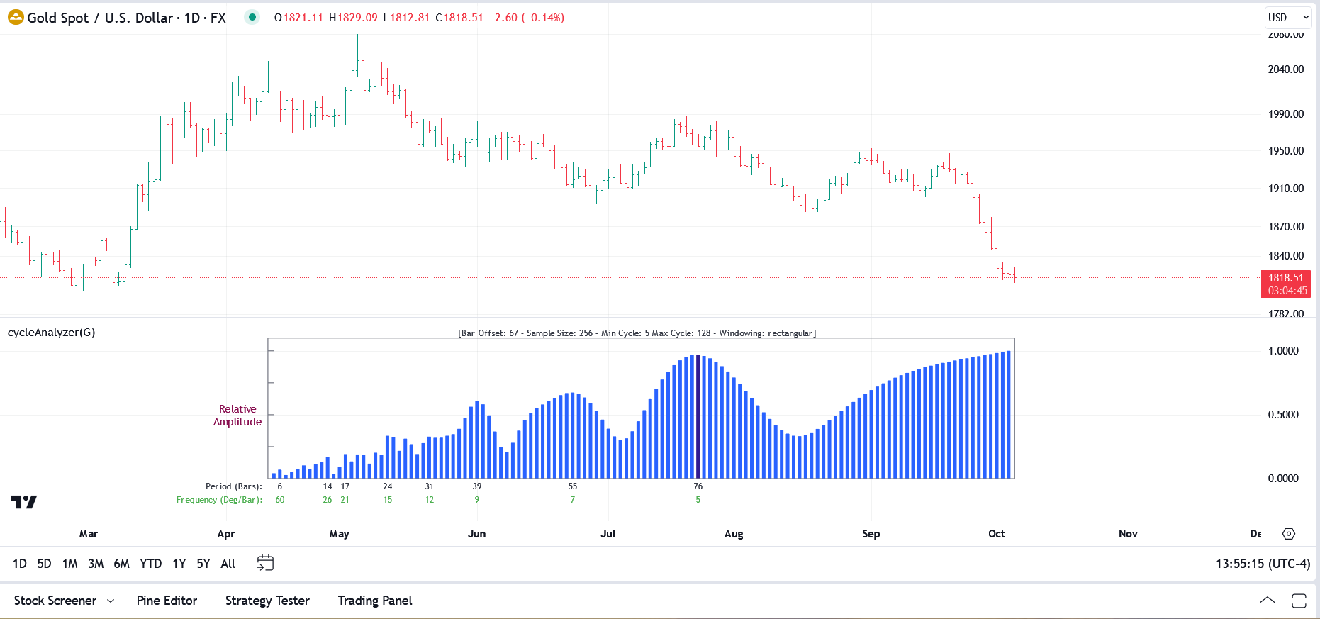
In the chart snapshot above, the blue histogram represents the power spectrum based on the window size selected (in this case that is 256 bars). The peaks in the histogram represent the distinct cycles that were observed in the data. In this case the strongest cycle (it is a peak that has the highest amplitude) is the 76-period cycle and you can see that it is plotted in a different color indicating that it is indeed the dominant cycle. The remaining cycles found were 55, 39, 31, 24, 17, 14, and 6 respectively.
The legend at the top of the spectrum will always show you the current bar offset, your current window size (sample size), the minimum and maximum cycle periods that appear in the spectrum, and the windowing function being used. Adjusting the Upper Cycle Limit and Lower Cycle Limit options in the menu will impact the min/max values in the spectrum.
In addition to providing a visual representation of the cyclical content of the price data, the power spectrum can also be used to visualize the impact of selecting different windowing functions.
General Operation
Once you create a cycle or composite plot, it will remain intact for a period of time as new bars come in. If the Auto-Calc Bar Offset option is checked in the settings menu, at some point, however, a newer/better offset will be automatically identified by the indicator and, when this happens, the silver vertical bar-offset line will move and a new cycle analysis will be performed.
If the automatic offset selected by the indicator is not to your liking you can always input your own Manual Bar Offset into the settings dialog.
The default Window Size of 256 bars seems to provide the best results, but feel free to experiment with the other settings. For securities in a strong trend, the 512 window may provide a clearer picture and expose longer cycles. Conversely for very choppy/noisy price data, dropping to the 128 window will likely provide better results, albeit with a concentration on the smaller frequencies. With the current version of cycleAnalyzer it is very quick and easy to select the best window size. Just change the Window Size in the settings dialog and then compare the out-of-sample cycle plot with the actual price data to determine which window size gives you the best results.
When viewing the results of the cycle analysis, keep in mind that the price data used for the cycle analysis has been normalized and detrended. This is particularly evident when viewing a Composite plot for a security that is in a strong up or down trend. The Composite plot will display the cyclical price action but it will NOT display the trend.
Lastly, some of you may be familiar with the original version of our cycleAnalyzer indicator which used a two-pass process. The first pass would identify the cycles, and their relative amplitude and phase. You would then type this information back into the indicator and it would create the cycle plot in the second pass. It was effective but somewhat cumbersome.
In the current version we have done away with the two-pass system and we now display the cycle plot immediately when the indicator is loaded into a chart. To do this we had to make use of the Pinescript 'Line" object, which allows us to draw lines (which is different from a 'plot') from within any TradingView indicator. We use these line objects to draw the cycles as well as the Composite plot. However, TradingView currently limits the total number of line objects to 500, and we use one line object for each bar. This means that when we are drawing the 3 individual cycles, each cycle plot is limited to 166 bars (roughly 500 divided by 3). And when drawing the Composite plot we are limited to 500 bars. At some point in the future it is likely that TradingView will increase these limits but, for now, we have to abide by them.
Under the Hood
The cycle analysis process in our cycleAnalyzer indicator is based on the Goertzel algorithm. A wikipedia article can be found here. From a computational complexity standpoint it is fairly lightweight and very efficient.
If the DeTrend Data? option is selected in the settings dialog (as it should be) the price data itself is processed before being applied to the Goertzel algorithm. We flatten the endpoints to remove any trend and translate the price data into the domain between 0 and 1.0.
The window sizes of 128, 256, and 512 are fairly standard in the DSP world. For short-term cycle analysis of financial data (which is fairly noisy) the default window size of 256 seems to provide the best/most consistent results, but you can certainly experiment with the other window sizes.
See Also:
